

Hello guys! Our artist Philip Bell talked about the stages of creating advertising works for the project. So, without further ado, let’s get started!
___________
– Development pipelines for splash and key-art are often similar across studios. While industry-wide standards are followed worldwide, individual performers have their own preferences, tips and tricks. Today I would like to show off the work we have done in our studio.
For this particular key art, we had a clear concept, a predetermined color scheme, and a vision of how it should look. The primary purpose of this image is advertising, as it will be used as a large pre-order banner with text overlay. We used this as a starting point when creating the initial sketch.
Here is the first iteration:
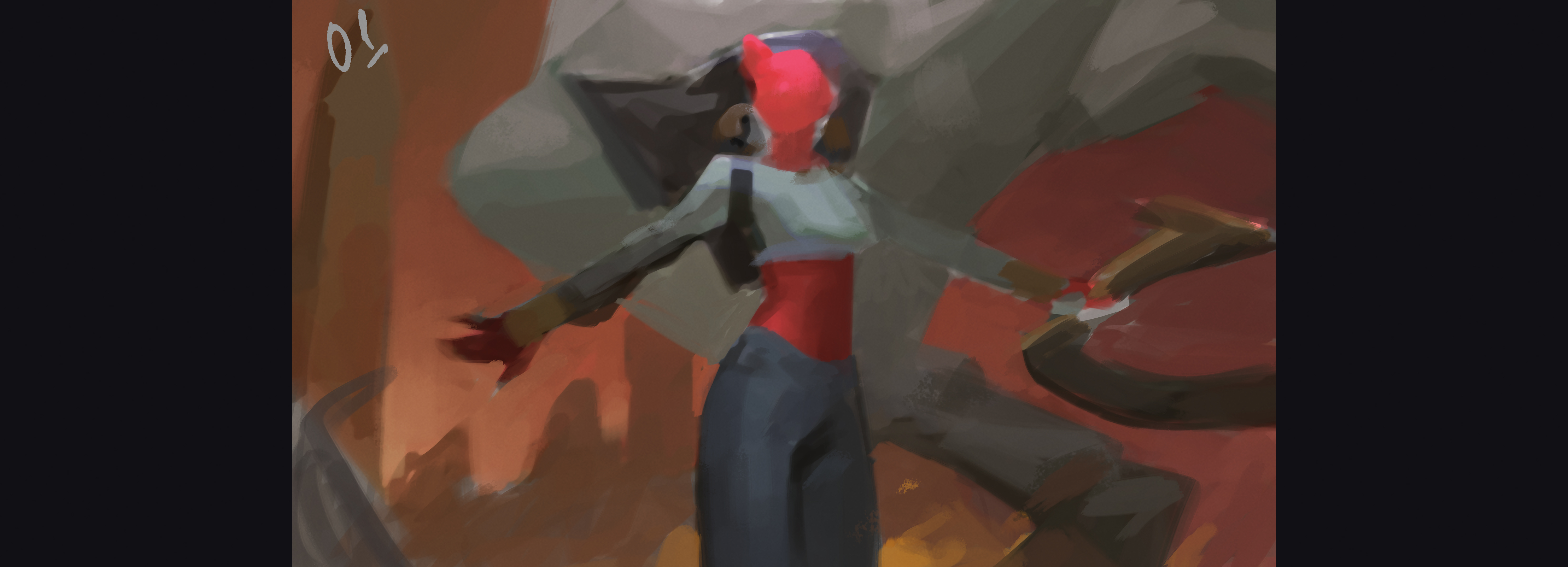
We were able to create this iteration in less than an hour. Our goal was to vividly present the main character, the demon, in the center of the canvas, accompanied by weapons against a background of smoke and fire. We tried to create something simple, but lively and dynamic, without relying on complex poses. To achieve a sense of dynamism, we included compositional elements in the background, such as S-shaped puffs of smoke.
The lower part of our piece, especially the legs, can look static and monumental, since it will contain a significant amount of textual information. We’ve kept it simple on purpose so that the text remains unobstructed.
After further refining the sketch and placing the approved graphic design and text elements, we noticed that the character’s arms and weapons were too close to the text. As a result, we made adjustments to their position.
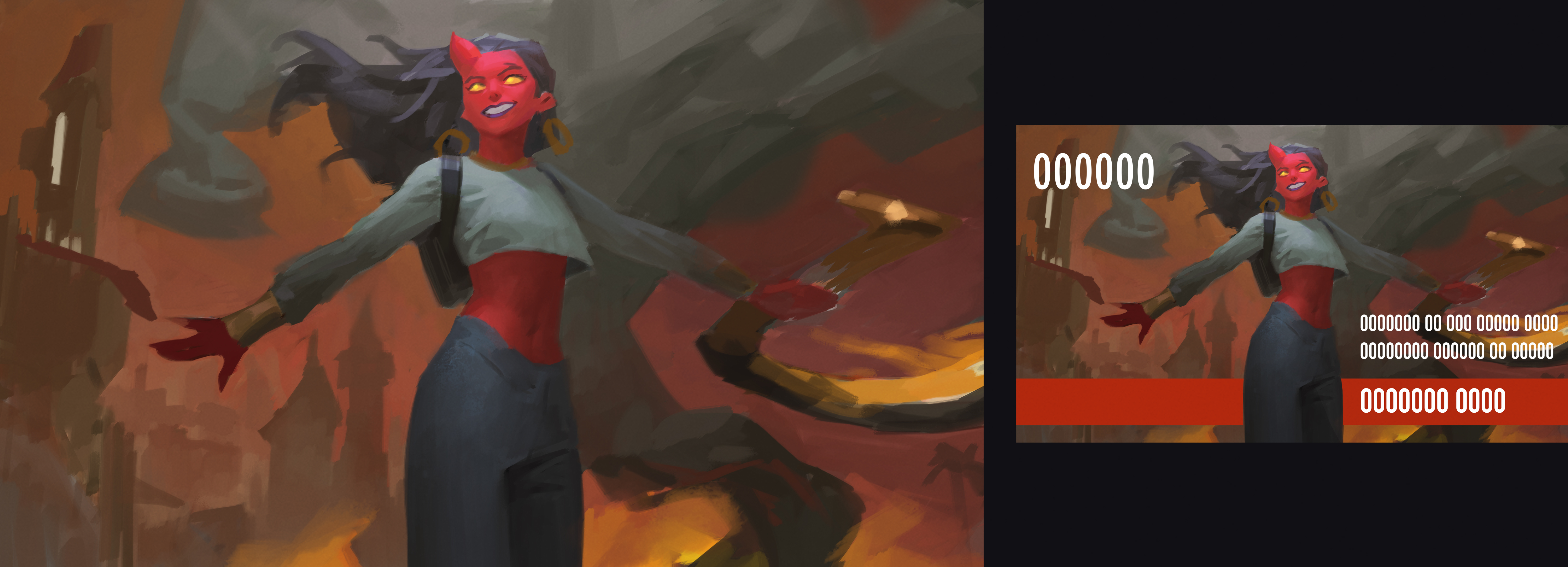
Here’s an updated sketch:
With these modifications, the main focal points have been moved up, creating more available space that we can use efficiently. Additionally, we successfully incorporated a second character into the artwork, increasing the overall appeal of this key art.
In the early stages and halfway through, we work with a lower canvas size resolution of approximately 2000px. Although at this stage it is still a sketch that serves as a basis for further work, all elements have been constructed and organized. Now we can move on to the next step, which involves developing the image through the initial rendering process:
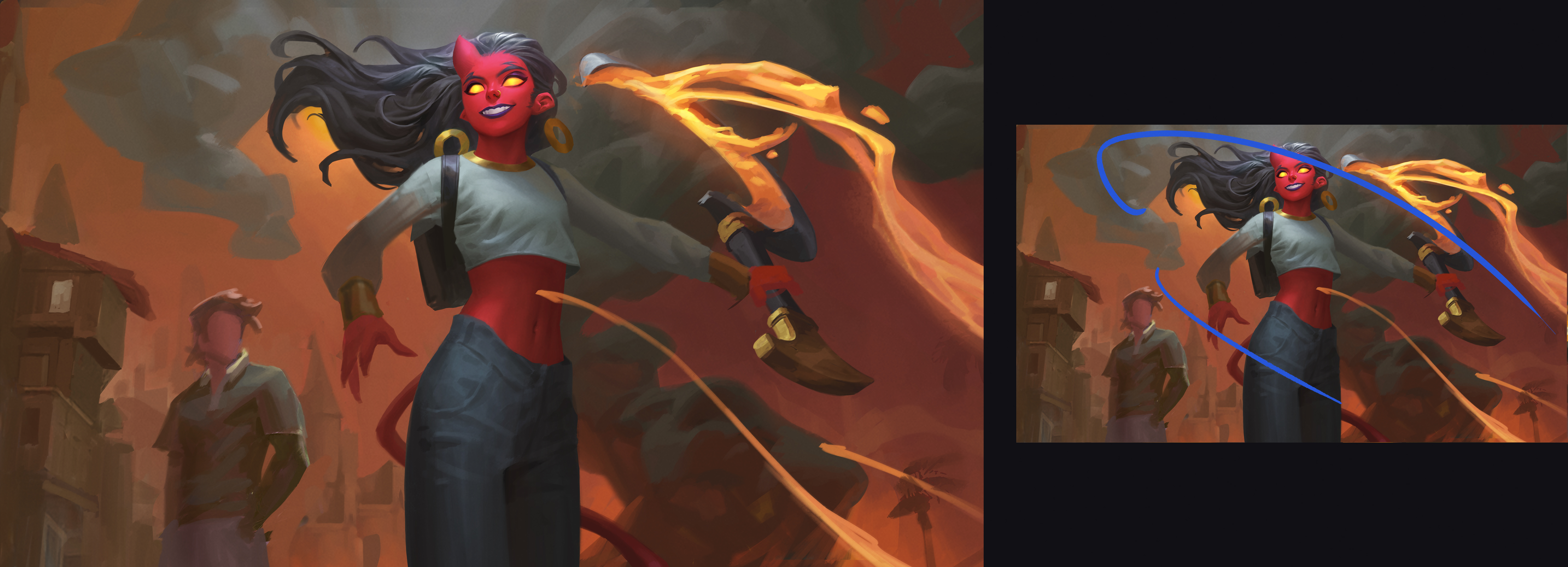
This iteration met our expectations and we continued to develop it. However, we felt the need for more focus and emphasis. It is very important that the ad image engages the users when they look at the splash screen. To solve this problem, we added a sunlit area behind the second character’s head, enhancing the city lights in the background, and a brighter dramatic overhead light for the main character.
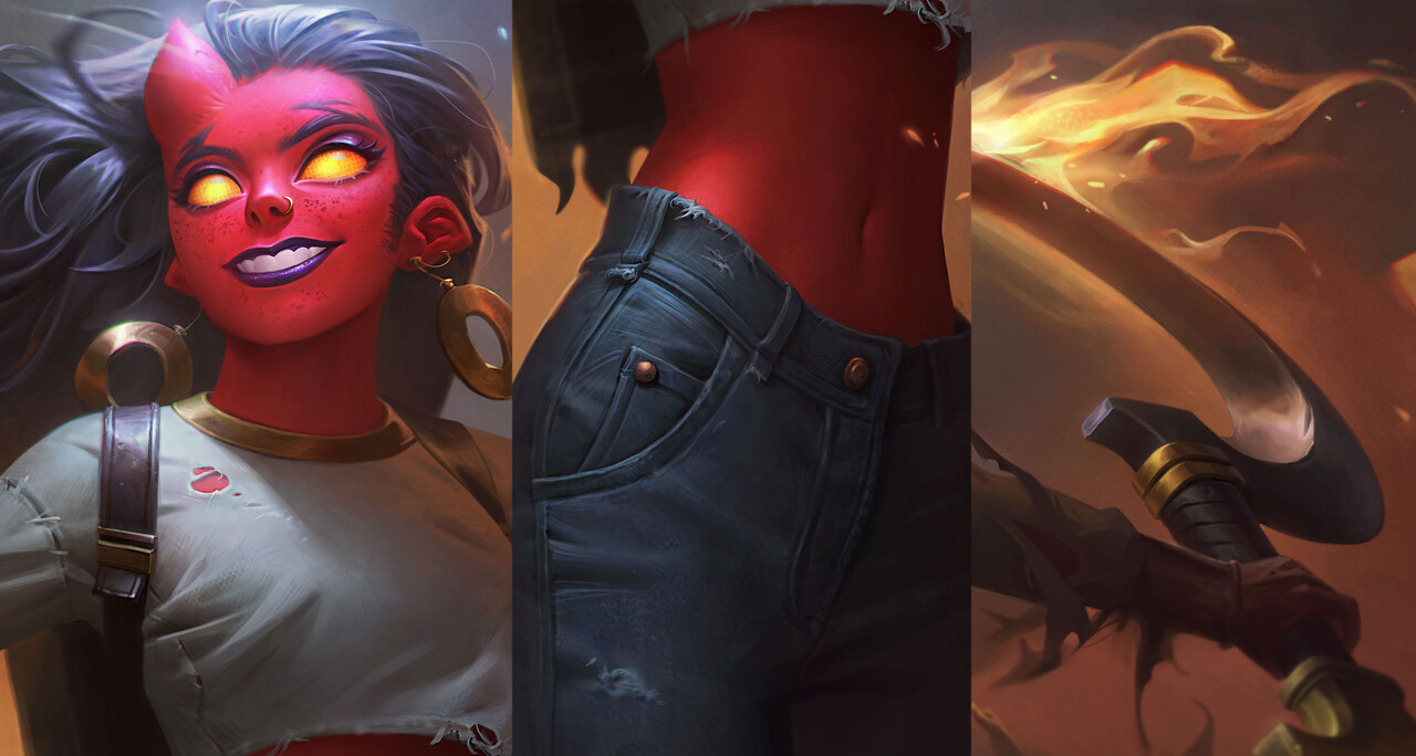
We also started the image rendering phase. We move to the rendering stage only when we are satisfied with all the compositional elements of the illustration. Our focus was on refining clothing, faces and materials, adding halftones and creating a softer overall effect. In addition, we increased the contrast so that the main character stands out more clearly against the background.
___________
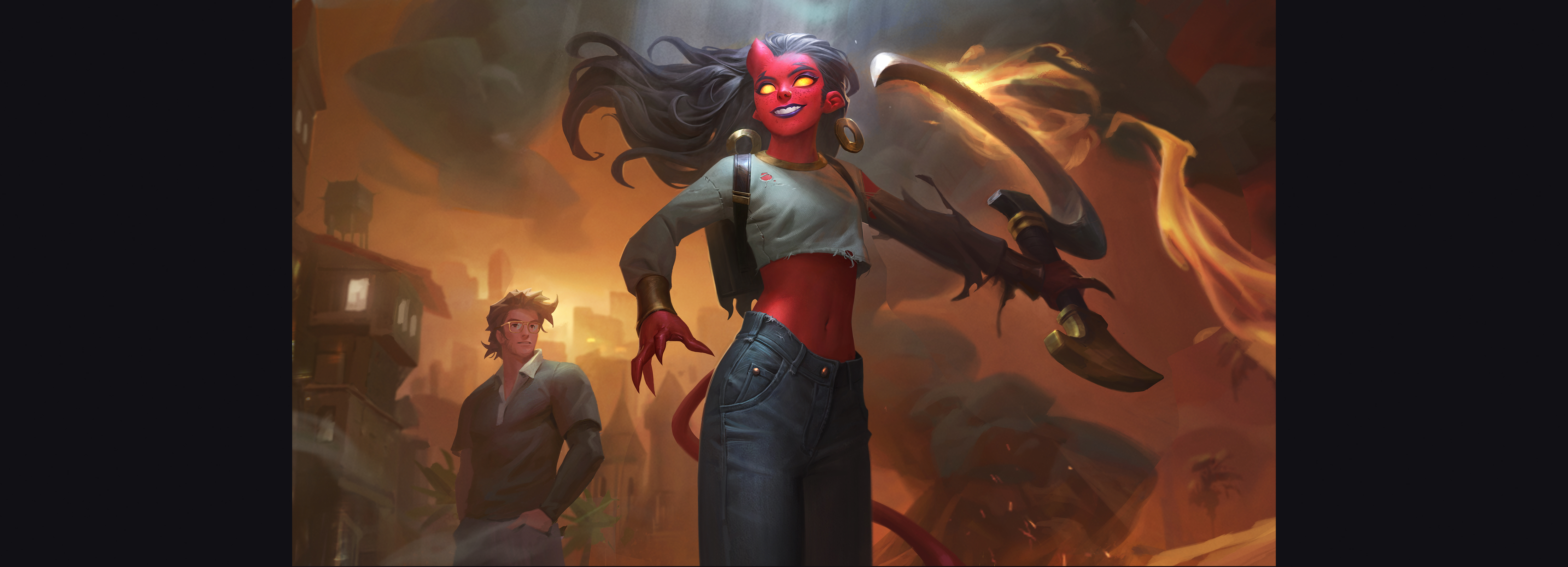
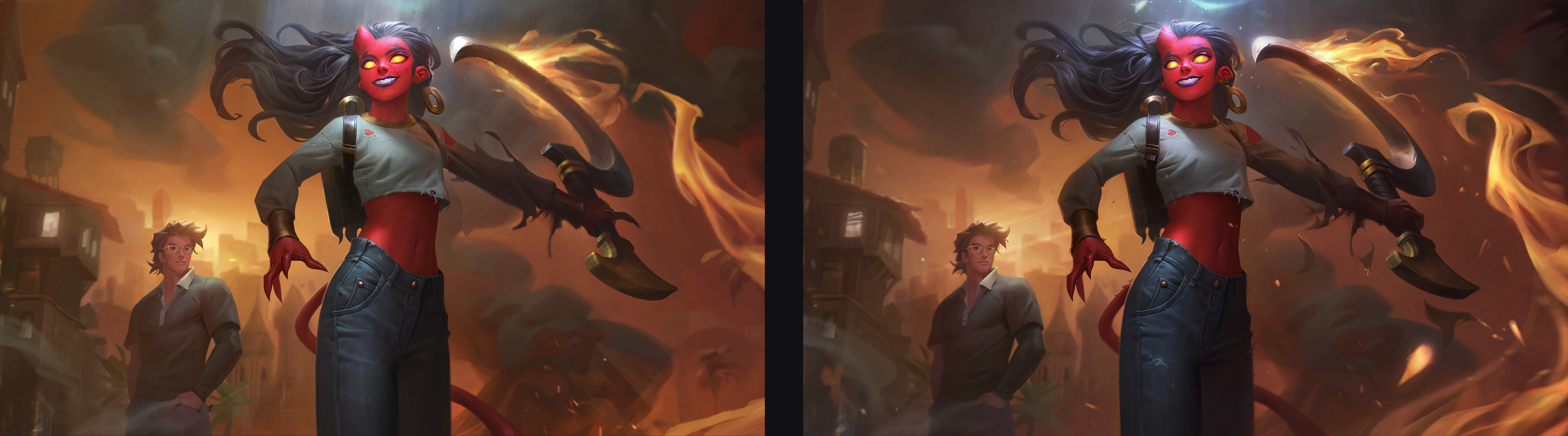
Moving on to the final stage, we now focus on color correction and achieving a finer contrast balance. This painstaking process involves manually comparing and adjusting various elements so that the overall illustration looks impressive. We eliminate excess yellowness and enhance visual effects. Please take a look at the comparison of the progress before and after the color balance:
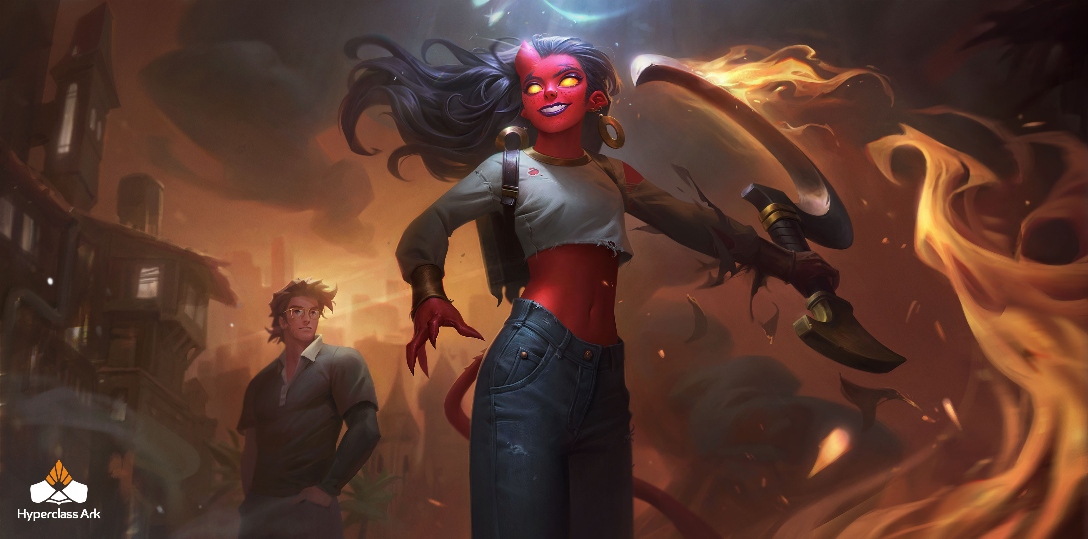
At the last stage, we cut and prepare the file. Here’s the progress we’ve made:
___________
Thank you for accompanying us on this creative journey. If you are interested in us creating something extraordinary for you, please do not hesitate to get in touch. We are happy to discuss further possibilities.
Philip.
https://www.hyperclassark.com/